Berries in Charts: The category’s evolution over the last nine years
By
| 23 October 2019

Coming out of PMA Fresh Summit, I feel fortunate to have been able to have had a great many conversations with industry leaders from around the world. This article is inspired by one of those conversations.
One of the functions of working with data is to offer perspective. So, after being asked how the different berries stacked up against each other I brought up this chart, which created one of those invaluable ‘ah ha’ moments.
Below you can see how the different berries have evolved over the last nine years compared with each other.
Historical berry volumes in the U.S. market
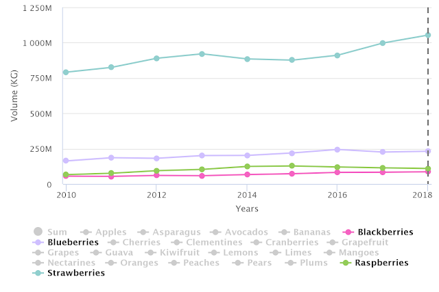
Source: USDA Market News via Agronometrics. (Agronometrics users can
view this chart with live updates here)
My hope with this chart isn’t to explain some interesting market phenomenon, but rather just to offer it as an interesting point of view to better understand the role of each berry in the U.S. market.
Written by: Colin Fain
Original published in FreshFruitPortal.com on October 22, 2019 (Link)
Related Stories