Apples
Asparagus
Bananas
Blackberries
Cherries
Clementines
Cranberries
Grapefruit
Grapes
Guava
Kiwifruit
Lemons
Limes
Nectarines
Oranges
Peaches
Pears
Plums
Raspberries
Strawberries
Fruit in Charts: The winners and losers of 2018 (Part 3 of 3)
By
| 29 January 2019
This article is the culmination of two previous posts that explored which commodities grew the most and the least through prices and volumes in both 2018 and over the last eight years. You can catch up on those previous articles with the following links:
The Winners and Losers of 2018 (Part 1 of 3)
The Winners and Losers of 2018 (Part 2 of 3)
The Winners and Losers of 2018 (Part 1 of 3)
The Winners and Losers of 2018 (Part 2 of 3)
In the process of writing the previous two articles, we saw that many of the commodities that had the highest prices also had the lowest volumes, and vice-versa. This begs the question, where are the best opportunities in this industry, where is growth and how do we define it? So in this article we will look at creating an index that combines the two factors and see if it can shed some light on this.
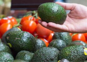
One of the most contentious commodities of 2018 was avocados, which saw the biggest drop in average yearly price compared with all other commodities we track. Avocados also saw one of the largest increases in volume of any commodity that we track. In the graph below we set the average yearly growth of price and volume of avocados against each other to help illustrate what we are seeing in the market.
Avocado Prices and Volumes

(Source: USDA Market News via Agronometrics)
[Agronometrics users can view this chart with live updates here]
[Agronometrics users can view this chart with live updates here]
To best represent the evolution of the relationship between these two lines, we need to consider a third parameter – one that takes into consideration both price and volume. The solution is more simple than one might guess, because by simply multiplying the two you get a line that evens out the variance between price and volume – in effect isolating only growth. From there we can calculate percentages in a similar method to what we had done with the prices and the volumes. The table below show what this looks like with the data from the above chart.
Avocado Yearly Percentage Growth
The data we are using this method is not perfect, but it is the best method I have found with which to understand how markets are growing and compare commodities. Given that shipping point prices exaggerate high prices – mostly because they only capture the spot market which has to respond to deficits left by programs – the values when prices are high will be higher than they should be, but otherwise I believe this method to be representative of category growth. On the other hand, plums, nectarines and grapefruit all show increases in pricing but have demonstrated the least amount of growth given their decreasing volumes. So this is the best of 2018. I look forward to highlighting some of the most intriguing stories in the market during 2019 and circling around next year to look at how each commodity has grown and evolved in a similar report for 2019. In bold, the commodity “All” represents the average growth for all the products we have in Agronometrics, so commodities above this line should be more attractive than the ones below. To read this chart, keep in mind that 100% equals the same volume as last year, where anything above is growth and anything below is a loss. Yearly Percentage Growth by Commodity
|
||||||||||||||||||||||||||||||||||||||||||||||||||||||||||||||||||||||||||||||||||||||||||||||||||||||||||||||
|
† Commodity growth is not a figure with which to quantify the value of the market as Shipping Point prices only represent a percentage of the volume being commercialized, it should only be used as an abstract tool with which to look at growth.
The (*) has been included to next to mark fruit that as of 2018 and partially in 2017 included fruit volumes that were prior to not recorded, which could distort growth statistics. You can see more about this in the previous article The Winners and Losers of 2018 (Part 2 of 3).
Written by: Colin Fain
Original published in FreshFruitPortal.com on January 29, 2019 (Link)
Related Stories